Process
Ideation, research, Ethnographic observation, Problem definition, Market analysis, Brand solution, Prototyping, User Testing, Validation
Context
In this matter of the Masters in Design Management, the creation of a new business was requested.
So I started by looking for current problems and separating them into technology, economics, social, environmental, and politics. From these setbacks, and after a selection of those considered to be the most important, it was concluded that food waste was increasing very quickly worldwide. With the area for the new service defined, a survey was carried out to find information and data to help in the subsequent phases. This investigation was divided into three parts: desk research, an online questionnaire, and interviews. Amid other stages of the process, it was defined that the service would be hosted on both mobile and web platforms.
Finding the problem and structuring the business
In the initial research, numerical data were sought to prove food waste, justifications for it, countries where it happens more regularly and which are most affected, how are the supply chains and what is already being done to circumvent this problem. It was noticed that food waste is something very serious and ⅓ of the food produced is not used, and in Portugal alone, more than a million tons of food is thrown away.
With the online questionnaire, more than noticing some general problems of the population, the objective was to obtain data that would help in the creation of the brand's personas. The questionnaire had 114 responses.
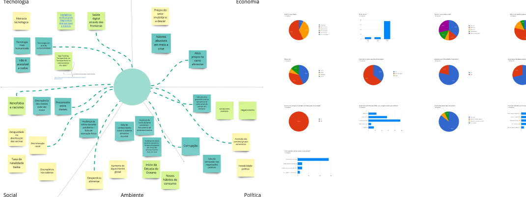
WWL Brainstorming and questionnaire
Regarding the interviews carried out, they were made to six people: Lion Club president; two nutritionists; a Re-Food volunteer; a member of the Rolante Local Economic Development Council); and a student. With the interviews, it was possible to understand how some organizations work, what are the problems in food production chains, and why most people end up wasting food: lack of time and ideas.

Interview main points
From these interviews, a focus group was created, consisting of two nutritionists (one with three children), the Lions Club president, and two consumers. With the data obtained from the questionnaire and with some insights from the interviews, three personas were created (I will put here just one image to summarize), in a group workshop, to help to understand the needs, difficulties, and desires of the people who will be part of the festival. For each persona, a journey map of what would be their day was also created.
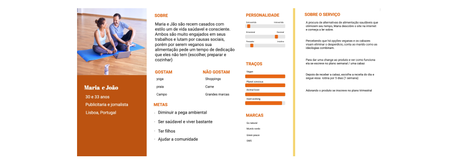
Persona 1
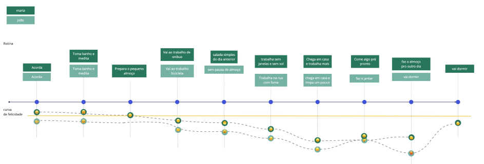
Journey map
With all the insights gained in the research phase, and with a “How Might We” workshop, it was possible to complete the problem statement – people need a food alternative because they don't have time to make nutritious meals with minimal waste – and, with the help of the “Pizza Challenge” activity and the use of a spectrum of business characteristics, the aspects of the subscription service for the baskets were defined. After these workshops, it was defined which social aspects and which sustainable aspects should be part of the brand, as well as the stakeholders.
"People need a food alternative, because they don't have time to make nutritious meals with minimal waste."
Competitive Analysis
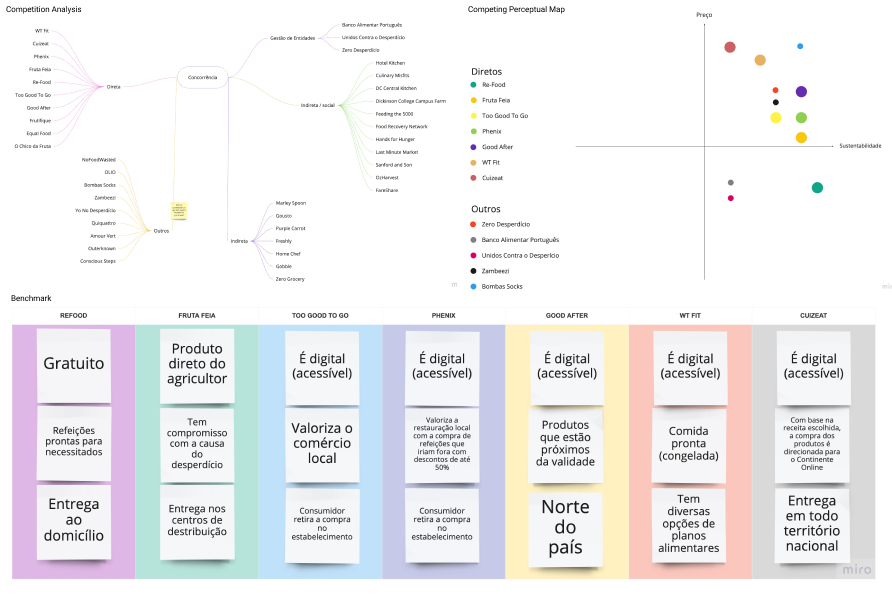
For the market analysis, the group started by drawing up a scheme divided into five groups: direct competition, which are similar businesses that exist in Portugal; entity management; indirect competition, which are the basket services that exist worldwide; indirect/social competition, which are companies related to food but that has a social action behind them; and others, which are businesses that, despite not belonging to the food industry, have a notable social aspect. Then, a table was made with all competition explaining its characteristics, a perceptual map with all direct competition and some services from other groups, and a perceptual map only with direct competition and with the ideal positioning of the new service. To highlight the most important aspect of direct competition, a benchmarking was carried out with the best characteristics of the brand.

Brand Analysis and Visual identity
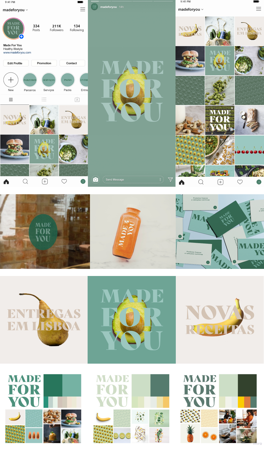
Comparison of graphic brands of competing companies Initially, to understand and identify visual recurrences within the researched field, an exploratory analysis was carried out on graphic brands in the segment. For this, the competitors found were separated into groups: name, name, name, name, name.
In this research, it was noticed that competitors usually have their names written in italics or a non-serif font in capital letters. When the brand has symbols, these are related to food, or words in the brand name. And its color palette is predominantly warm and strong.
From the information collected during the briefing and in the subsequent stages of the questionnaire and benchmarking, the company's conceptual guidelines were defined:
Accessible
Confidence
Honesty
Safety
Transparency
Simplicity
Sympathy
Sincerity
Sustainability
An initial mood board was created with a focus group to define the company's elements and colors.
After studying the concepts, market research, and choosing the style, the refinement for choosing visual references began.
The Brand consists of the company name presented with designed typography, serifs, and robust.
As for colors, it uses only white, black, and green in your communication in digital environments, with graphics as well as photographs. The visual communication style is contemporary and linked to current trends, with monochromatic tones and text layout in standard alignment.

Wireframes, Prototyping and Testing
An application concept map was created to represent the relationships that application pages will have. The expected functions come from research with focus groups and references researched during this project, which were analyzed and limited to a final prototype with better performance.

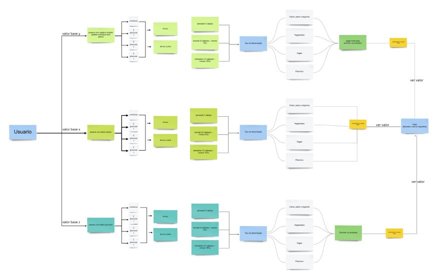
In the flowchart below, it is possible to see the expectations of users concerning the purchase flow on the platform. At this stage, the ideas were reorganized to meet the wishes of future customers and this was reflected in the wireframes also created together in the workshop.

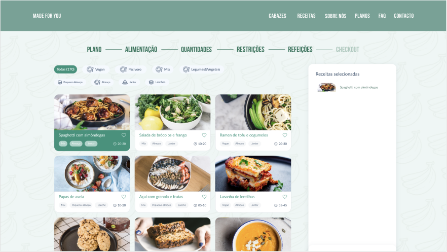
After studies and tests with the suggested screens, it was possible to dry the elements present within the application to better fit the scope. The main color green was applied to create medium fidelity prototypes in Adobe XD in order to test the application flow with real users.
It was initially chosen to create the test flow in mobile format because it was how users were more comfortable in simulating the purchase and was consistent with possible usage scenarios.


Lessons and insights
The whole project was made in a short time, but it was very nice to develop and be able to experience all the iterative processes of creating a business. Many times I got myself back to the begging to check if the thoughts still make sense.
Was also a very scary surprise when I started the interviews and group focus just to realize the users wanted something way simpler than what I suggested. Of course, I knew this would happen, but still right at the beginning of the project, on the service definition itself, they already turned the table haha.
 WWL Brainstorming and questionnaire
 Interview main points
 Persona 1
 Journey map
